潘通發(fā)布2022年度色彩:仙女紫 Pantone unveils Color of the Year for 2022
中國日報網(wǎng) 2021-12-09 10:50

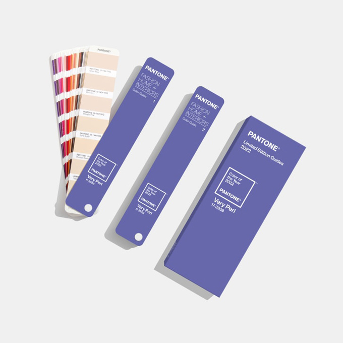
潘通日前發(fā)布了2022年的代表色彩,這是一種用寧靜藍和活力紅調(diào)制而成的新顏色,潘通將其稱為“仙女紫”。這是潘通首次選用新顏色作為年度色彩,旨在傳遞強烈的新感覺。
While many of us will spend the final days of 2021 reflecting on its whirlwind events, global color authority Pantone has already been busy looking ahead -- to decide on the shade that will best encapsulate 2022.
2021年到了尾聲,許多人都在回顧過去一年接踵而至的紛繁事件,全球色彩權(quán)威機構(gòu)潘通卻早已開始展望未來,決定出最能代表2022年的顏色。
On Wednesday it unveiled Very Peri, a periwinkle hue that the company says combines the steady tranquility of blue with an energetic infusion of red. It's the first time the company has manufactured a color instead of delving into their pre-existing archive.
12月8日,潘通發(fā)布了2022年度色彩,仙女紫。據(jù)稱這種長春花紫色是將寧靜藍和活力紅混合而成。這是潘通首次選用自己調(diào)制的新顏色,而非像以往那樣選用色庫里已有的顏色。
"It was really important for us to come up with a new color, because we have a very new vision of the world now," said Pantone Color Institute's Executive Director Leatrice Eiseman in a video call.
潘通色彩研究所的執(zhí)行總監(jiān)麗特里斯·艾斯曼在視頻會議中講道:“選用新顏色作為年度色彩對我們來說真的很重要,因為我們現(xiàn)在對世界的看法已經(jīng)煥然一新。”
"It is literally the happiest and the warmest of all the blue hues," she added, describing the shade. "Because of that red undertone, it introduces an empowering feeling of newness, and newness is what we're looking for."
她在描述這一顏色時說道:“這是所有藍色調(diào)中最快樂也最溫暖的顏色。加入的紅色給人帶來一種強烈的新感覺,而這種新感覺正是我們要尋找的。”
The pandemic has heavily impacted how we normally live and work -- posing obstacles that have forced people to think outside the box.
疫情深深影響了人們正常的生活和工作方式,也帶來了重重阻礙,這迫使人們跳出固有思維模式。
"We've gone through so many challenges over this time, we don't know what's going to pop up from one day to the next," said Pantone's vice president Laurie Pressman, who was also on the call. "It's curiosity that's helping people to get through these difficult times. What we would call courageous creativity."
潘通色彩研究所副所長勞里·普雷斯曼在視頻會議中說:“這段時間我們經(jīng)歷了這么多挑戰(zhàn),我們不知道明天還會發(fā)生什么事。正是好奇心幫助人們度過了這些艱難時刻,或者可以稱之為勇敢的創(chuàng)造力。”
"The color symbolizes the future," Eiseman adds. "(It) has that sprightly, joyous attitude that we're talking about, that carefree confidence, and creative spirit."
艾斯曼補充道:“這一顏色象征著未來。它包含著我們談?wù)摰哪欠N活潑歡樂的態(tài)度,那種無憂無慮的自信,還有創(chuàng)新精神。”

Each year, Pantone attempts to interpret the zeitgeist through the lens of color theory -- mining the likes of fashion, design and interiors for clues.
每一年,潘通都試圖通過顏色理論來解讀時代精神,從時尚、設(shè)計和室內(nèi)裝修等各個領(lǐng)域去找尋線索。
And it's no stranger to making unconventional picks: In 2016, the company chose a gradient made out of two shades, Rose Quartz and Serenity, to reflect a year defined by shifting gender politics. In 2020, not one but two colors -- Ultimate Gray and Illuminating (a vibrant yellow) -- were selected to capture both the resilience and optimism shown during the first year of the pandemic.
在挑選年度色彩方面,潘通慣于打破常規(guī)。2016年,潘通選擇了水晶粉和寧靜藍兩種色彩的漸變組合來反映性別政治變遷的一年。2020年,潘通選擇了兩種顏色——極致灰和熒光黃——來表達人們在疫情第一年所展現(xiàn)出的堅韌和樂觀。
The annual task of forecasting the color that will best reflect the year ahead has been a more than 20-year endeavor, beginning as a desire to cultivate conversations around the power of color, says Eiseman.
潘通每年都要選出最能代表下一個年度的色彩,艾斯曼指出,這項已經(jīng)持續(xù)了20多年的任務(wù)最初是為了引發(fā)人們關(guān)于色彩力量的對話。
"We first did color of the year to get people talking about (the role of) color," she said. "And once you get them talking about it, you then create a buzz and the realization hits them: color is such an integral part of our everyday lives, but we take it for granted."
她說:“最初我們發(fā)布年度色彩是為了讓人們談?wù)擃伾淖饔谩R坏┯懻撻_始,就會產(chǎn)生熱度,然后人們會意識到,顏色是我們?nèi)粘I钪腥绱瞬豢扇鄙俚囊徊糠郑覀儏s往往視而不見。”
英文來源:美國有線電視新聞網(wǎng)
翻譯&編輯:丹妮






 英語點津微信
 雙語小程序
雙語小程序